Case Study

Overview
Class CrunchLabs is a free curriculum resource for educators founded by Youtuber Mark Rober. My capstone group for the Master's of Human Computer Interaction program partnered with Class CrunchLabs to provide UX/UI research and recommendations to improve teachers' curriculum integration experience.
Role and Outcome
For this project, I was in a group of 4 other designers. I actively participated in generative research, insight synthesis, UI design, usability testing, and report delivery.
Project Background & Users

The User
Teachers & Educators

The Medium
Class CrunchLabs Website

The Product
Curriculum Materials on G-Drive
The Problem to Solve
How can teachers access Class CrunchLabs more quickly and easily adopt Class CrunchLabs curriculum into their lesson plan?
Preliminary Research

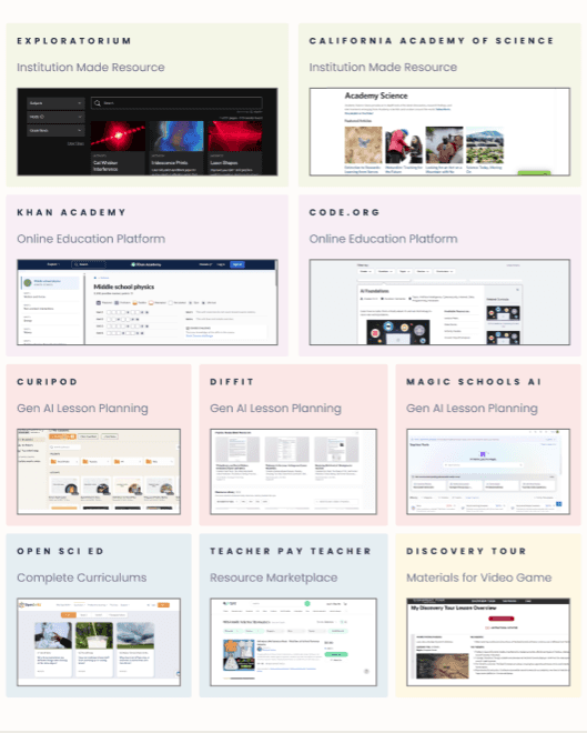

We conducted research through three avenues to understand the wants and needs of teachers and educators interested in using external curriculum material like Class CrunchLabs. Through this research we identified two key insights about Class CrunchLabs users.
1
Teachers rely on accessible and organized presentation of information about the material to determine whether or not it is worth the investment.
2
Teachers gravitate towards resources that make it easy to find and select material that's relevant to their specific classroom.
Low-Fidelity Prototype Testing
The Original Website

Mild Prototype

Medium Prototype

Spicy Prototype
We developed 3 low-fidelity prototypes to test in live interviews with teachers. When asked to rank the prototypes, the spicy prototype did the best overall while the original website did the worst overall. However, the features that were perceived to be most impactful and usable were scattered throughout the 4 versions. We decided to consolidate these things into our final prototype.
The Final Solution

Universal Standards
Filters for topics, grade level and standards were found across other sites evaluated in our competitive analysis
Teacher Behavior
We learned that teachers seek to locate standards and relevant classroom topics immediately upon browsing an external resource
Future-proofing
The design had to account for 90+ units planned in Class CrunchLabs catalog

Usability Enhancement
Improved the multi-tag interface to a dropdown filter system that searches for lesson number and video type
Before


Streamlined User Experience
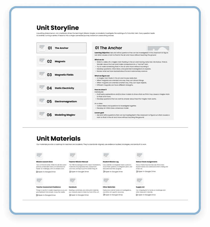
During the low-fidelity prototype testing, teachers liked how relevant materials were able to be previewed within the unit storyline instead of having to search for them across the page
Space Saver
The horizontal tabs are visually eye-catching while also saving room on the screen for a comprehensive overview of the unit
User Mental Models
Through our literature review, we found that teachers strongly value the organization of materials when evaluating external resources, so we separated materials for teachers and students.
What Didn't Make It

A navigational sidebar with a scroll spy and a page overview

The ability to bookmark units and materials using your Class CrunchLabs account

Time estimates for how long activities and lessons will take

Customization of the order and selection of lesson plan modules
The Results
perceived this site to be
usable for lesson planning
6.8 / 7
average rating for
trustworthiness and credibility

Reflection
This project with Class CrunchLabs provided valuable experience in planning design research and navigating client relationships. On the strategic end, balancing client feedback with research insights while navigating time and resource constraints was the greatest challenge for our team. I was able to flex my strategic decision-making muscles and learn how to negotiate user-centered designs. Ultimately, my team and I were able to deliver research insights that directly influenced Class CrunchLabs website interaction designs and a final prototype that was perceived to be usable and credible by teachers for lesson planning.